Object Parameters
As with all Plug-In Objects, the first time you place a Savvy Position Label object in a document, Vectorworks will ask you for default parameters. You can set the default object parameters for the document by selecting the object’s tool, then clicking on the parameters button in the mode bar.

Parameters
Object
- Text Style
Pick a text style for the label.
- Style
Use this menu to apply, create, or modify a Style definition for the object.
Savvy Position Label styles appear as “red” symbols in the Resource Manager, and specify whether parameters reference the style definition. For more information, see Concept: Plug-in Object Styles in Vectorworks help.
- Hide Style Parameters
Enable this option to hide any parameters linked to a style definition.
- Linked to
Read only field displaying the name of the position to which the label is linked.
When you select a Position Label, the position will highlight and you will also see a link icon in the drawing indicating the link.
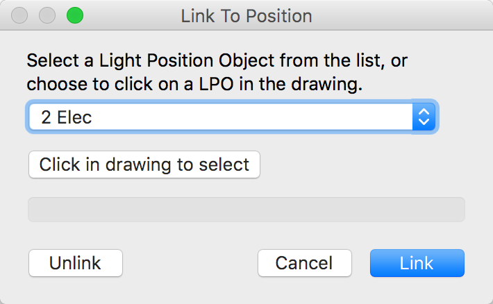
- Set Link
Opens a dialog allowing you to choose a Rigging Object to link with the label. Alternatively, you can click on a position object to establish or remove the link between the label and the position.
- Edit Position Name
Use this button to edit the name of the position.
If the Label links to a Truss System, this will edit the name of the System.
- Alignment
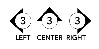
Left / Center / Right: Determines the text alignment and arrow position for the label.
- Move with position
Enable this option to move the label as you move the position, as though they are grouped. Moving the label, however, does not move the position.
- 3D Rotation
Enter a value for rotating the 3D component of the label around its horizontal axis.
- 3D Only
Setting the label to 3D only allows it to rotate to any 3D plane. In this mode, you do not see a 2D version of the label in Top/Plan.
Otherwise, the 3D component of the symbol can only rotate along its horizontal axis. For example, a rotation of 90 would face the label towards the front view.
Label
- Label Display
Determines how the position name displays in the label.
- Full
The full name
- First word
The first word, before a space.
“1a Electric” would be “1a”- Last word
The last word, after a space.
“Pipe A” would be “A”- Only Number
Extracts a number from the name
“#4 Elec” would be “4”- Custom
Ignores the position name and uses the text field below
- Cust. Label
Use with the Custom Label Display option to completely override the position’s name.
- Prefix
Adds a prefix before the label text.
- Suffix
Adds a suffix after the label text.
- Truss Identity
When the Label is linked to a Truss object, you can link to a single truss piece, a truss line, or the entire truss system. This option affects both the Label text as well as any data in the Note.
Shape
- Container
Circle / Rectangle / Rounded rectangle / Diamond / None
Choose a container for surrounding the label.
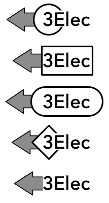
The circle and diamond containers will surround the first or last character in left or right alignments, while the other containers re-size with the label text.
- AutoFit
Fit the container to the label text.
- Width
If AutoFit is disabled, specify the size of the container, in page units.
- Padding
Add an additional amount of white space between the text and container, in page units.
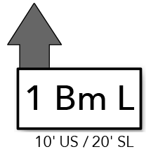
- Draw shadow
Add a drop shadow to the container.
- Use Class Options
Use the shadow options assigned to the class for the container.
- Shadow Settings…
Set the shadow options for the Container drop shadow. This uses the same interface as in the Attributes palette.
Arrow
- Arrow type
Triangle / Arrow / None / Symbol
Choose an arrow that points from the label to the position.
You can also select no arrow or a custom symbol for the arrow.
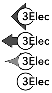
- Symbol
If you select the Symbol option above, specify the symbol here. Use the Select symbol button below to select a symbol resource.
- Arrow Angle
90 / 0 / –90 / Custom
Sets the arrow straight, up, or down, depending on orientation.
Select Custom to set an angle via the Cust. Angle parameter below.

- Arrow scale
Scale the arrow to refine the look of the label.

- Mirror Arrow
Enable this option to display an arrow on both sides of the label.

Note
Use these parameters to display a note under the label*. The note can be multi-line and show any text.
Similar to a Data Tag, you can also insert placeholder data tokens that dynamically update from your drawing.
- Show note
Displays the note.
- Text Style
Optionally, set a separate text style for the note.
- Alignment
Choose to align the note consistently with the label or specify its own Left, Center, or Right alignment.

- Wrap note
Enable this parameter to wrap the note to the length of the container.
- Fit container to note
With this option enabled, the container grows to include the note text.

- Note
The note text.
- Edit note
Presents a dialog for editing the note.
To add dynamic data to the note:
Position the cursor where you want the data to appear
Select one of the options in the lower section of the dialog
Click Insert to insert placeholder text at the cursor point

- Rounding
Round any dimensional data appearing in the note by this value.
- Adtl. Trim Offset
Enter a value to offset the reported trim from the position’s z height. Useful for trimming above decks, rakes, and platforms.
- Auto position note
Enable this to automatically position the note below the label.
When disabled, you will see a control point in the drawing for repositioning the insertion point of the note.
Leader Line
Use these parameters to draw a leader line between the Label and the position.
- Position X, Y
The coordinate of the position that displays in the note. This also corresponds to a control point in the drawing.
If the label is linked to a position and set to move with the position, this coordinate will adjust as you move the position.
- Reset Leader
Resets the Position X / Y coordinates to the insertion point of the position.
- Flip Leader
Reflects the Position X / Y coordinates across the midpoint of the position.
- Draw leader to position
Draws a leader line from the label to the position coordinate.
- Leader type
Straight / Bezier / Shoulder: Choose the type of leader line.

- Draw symbol at endpoint
Add a symbol to mark the position location, for example a boom marker or rigging point.

- Symbol Name
The name of the symbol.
- Symbol Rot
Rotation of the position marker symbol.
- Select symbol
Choose an available symbol resource for the position marker.
Classes
- Auto-Class
Enable this parameter to class each component with default class names. The prefix for subclasses can be determined in settings.
- Container Class
Class for the container geometry.
- Arrow Class
Class for the arrow. If no by-class options exist for the arrow, it will fill solid black.
- Shadow Class
Class for the container drop shadow.
- Leader Class
Class for the leader line.
- Note Class
Class for the note text.
Update
- Update
Any changes to the Rigging Object that affect the Savvy Position Label text, placement, or note should automatically update the Label, but this button will force an update to catch any unreflected changes.
Settings
Change settings that affect all Savvy Position Label Objects
- Default Insertion Class
Choose a class for all new Savvy Position Label objects, or choose to insert in the active class.
- Component class prefix
Enter a base class name that the Auto-Class option will use to build class names.
- Trim offset
Enter an offset for the trim display, for example to display trims above a show deck height, with this value subtracted the Hanging Position’s Z height. Note, the trim starts at the layer’s elevation.
- Make default for all new documents
Select to make the current settings selections the default for all new Vectorworks documents. This option only applies to the next time you press OK, and will reset itself.
About
Use to check the installed version and licensing.
You can also head here to enter your license key or initiate a demo request.